Abstract
adjective (abstrakt/)
1.existing in thought or as an idea but not having a physical or concrete existence.
2.relating to or denoting art that does not attempt to represent external reality, but rather seeks to achieve its effect using shapes, colours, and textures.
𝔸𝔹𝕊𝕋ℝ𝔸ℂ𝕋 – In photography, abstract is word to describe non-objective or experimental photography that doesn’t have a concrete or identifiable origin. The image can be cut up to show only bits of an original image, however what abstract photography usually aims to influence is more to do with sentimentality than anything else.
For me personally, abstract is something I relate to art and being unique or unidentifiable – as in unable to be explained or describe. I have many interests in artists that particulate in abstract art (Robert Delaunay 1885-1941, Henri Matisse 1869-1954 and more modern artists such as Jean-Michel Basquiat 1960-1988 and Jesus Raphael Soto 1923-2005), however abstract photography is not something that I have thought about.
𝔸𝔹𝕊𝕋ℝ𝔸ℂ𝕋𝕀𝕆ℕ– Abstraction (from the Latin abs, meaning away from and trahere , meaning to draw) is the process of taking away or removing characteristics from something in order to reduce it to a set of essential characteristics.
𝕎ℍ𝕐 𝔻𝕆 ℙ𝔼𝕆ℙ𝕃𝔼 𝔻𝕆 𝔸𝔹𝕊𝕋ℝ𝔸ℂ𝕋 ℙℍ𝕆𝕋𝕆𝔾ℝ𝔸ℙℍ𝕐?
Allows the photographer to convey messages and their emotions through the photo. It’s also a way for photographers to show the everyday person life from a different perspective.

𝕎ℍ𝕐 𝔻𝕆 ℙ𝔼𝕆ℙ𝕃𝔼 𝔻𝕆 𝕀𝕋?
Some people do it to make people see ordinary things differently. It’s almost about capturing a mood of a subject without making it obvious.
The photograph below is by Paul Strand. It is entitled ‘Abstraction, Twin Lakes, Connecticut’ and was made in 1916.
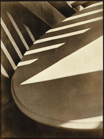
The image above is one we have been asked to study and carefully think about. We were asked to draw what we saw probably because it would help us really look at and observe the image.
I think the photographer was interested in Capturing the light and shadows and the different shapes produced. Not focusing on the actual object but centering the diverse shadings of black, grey and white.
My title would be Conflict because this image portrays conflict between objects and the light, ending with a product of shadows and divided light.
One unusual thing about this image is the different tones and how they create an unidentifiable subject.
I think the photograph looks brown because? The original colours have conflicted with the shadows and characteristics of the camera to produce a brown colour. Also, brown is the usual colour of shadows.
If I had to make this photograph I would focus on areas where light is blocked by different objects or where shadows are available.
I would use shadows and light to create and abstract product.
The best thing about this photograph is how the shapes and the shadows and light combine to make not one central concept, but as many as your imagination can produce.

This photograph I analysed seems to be a woman who is sitting on a chair, in the corner of a room. she is holding a drawing up to her face. The painting also includes some sort of outlining or shading under the eyes; a nose – and also a barely visible, (as the nose) mouth. The woman is wearing a plain white button-up shirt, which is tucked into a long maxi skirt of which the colour is not recognisable because of the chosen effect. Her clothes are simple but add up to an outfit that looks modern and outdated or traditional at once. At her feet, there is, what looks like another painting. This time of a man’s face. On this picture, the eyes are also heavily outlined, but more equally than the facial features before. There is dark paint, supposedly hair, surrounding him. At the top left-hand corner of the image, is white covered here and there by grey splotches. On the left side, also near the woman’s feet, is a plant pot. On the wall to the woman’s top left, there is a picture of another woman with dark hair and a headband. The frame of the picture is in the shape of a shield The colour of the room’s walls appears to be the same, almost the same as the woman’s skirt.
My eyes are immediately drawn to the painting that the woman is holding up to her face; there are many reasons why. Firstly, the image is closest to the middle of the picture, and also, it contrasts to the rest of the picture, which is mostly dark toning. I am also drawn to the peculiar facial features, especially the eyes, since they stand out from the bright background. Although the photograph is toned in dark colours, resembling a black and white photo, the elements used are fairly modern.
If I had the chance to ask the photographer a question, I think it would be does this picture reflect your emotions or your point of view? If I were naming this photograph, I would call it; ‘Natural Human Defences’. I would choose this name based on the elements used in the picture. The plant pot would symbolise the nature, the shield shaped picture portrays the defence, and the consistency of the faces would be the defence mechanism.
𝔽𝕆ℝ𝕄𝔸𝕃 𝔼𝕃𝔼𝕄𝔼ℕ𝕋𝕊
Photographs consist of formal and visual elements and have their own ‘grammar’. These formal and visual elements (such as line, shape, repetition, rhythm, balance etc.) are shared with other works of art. But photographs also have a specific grammar – flatness, frame, time, focus etc.
FOCUS – The alteration of the distance setting on a lens, creating a sharp and/or obfuscating effect on individual sections of an image.
LIGHT:LINE:REPETITION – Illumination or luminescence of any kind, e.g; fluorescent or natural. A series of straight, curved or any shaped rule in an image. “Lines can be effective elements of composition, because they give structure to your photographs. Lines can unify composition by directing the viewer’s eyes and attention to the main point of the picture or lead the eyes from one part of the picture to another. They can lead the eyes to infinity, divide the picture, and create patterns. Through linear perspective, lines can lend a sense of depth to a photograph. (Linear perspective causes receding parallel lines to appear to converge in the picture. This allows you to create an illusion of depth in your pictures.)” Taking an image with a re-occurrence of shape, colour or other elements to add a statement or intensify the allure of an image.
SHAPE – The use of two-dimensional elements and their exterior to form to create and identifying point for the viewer of the image.
SPACE:TEXTURE – Is there depth to the photograph or does it seem shallow? What creates this appearance? Are there important negative (empty) spaces in addition to positive (filled) spaces? Is there depth created by spatial illusions i.e. perspective?If you could touch the surface of the photograph how would it feel? How do the objects in the picture look like? How would they feel?
VALUE:TONE – Is there a range of tones from dark to light? Where is the darkest value? Where is the lightest?
In this photograph, I wanted to explore the light and dark elements you could have in photographs. I used a Canon —- camera with a — lens to focus the picture more and see the lights and darks better.
One strength in this piece is the detail on the bridge, I think it really gave it an abstract look as if it was just a plain bridge, I think it would be quite boring.

EXAMPLES OF ABSTRACT PHOTOGRAPHS


This was made by László Moholy-Nagy. This photogram strikes a great balance between concretization and abstraction. You can still tell a certain degree what objects made these forms, while at the same time they seem mysterious, depict new stories, arise new emotions, are combined in new ways and are just beautiful for themselves.
It shows the Tone really well how it goes from dark to light in not so solid colours, the lighter colours are more focused in the middle/bottom right whereas the darker areas are upper and left area of the picture. It also uses shape because of the lines that start to form shapes in the photograph.
SOME OF MY ABSTRACT PHOTOGRAPHS


This is a mind map of what I thought Abstraction included:

PHOTOGRAMS
A photogram is a photographic image made without a camera by placing objects onto the surface of a light-sensitive material such as photographic paper and then exposing it to light. The usual result is a negative shadow image that shows variations in tone that depends upon the transparency of the objects used.
Areas of the paper that have received no light appear white; those exposed through transparent or semi-transparent objects appear darker. Some of the first photographic images were photograms.
1.) The first step is to turn of the lights to the safe light to protect the photographic paper.
2.) You prepare the chemicals; Developer, Stop and Fix in order.
3.) Then choose your objects that have patterns and different shapes to make the rayographs look interesting. (non-transparent objects work well)
4.) Place your photographic paper on the enlarger.
5.) Make sure you have the filter in the correct place so that the light doesn’t damage the photographic paper as it is sensitive to light.
6.) Put the objects you choose on the paper you can over lap them and put them in different positions.
7.) Then you can remove the filter.
8.) You set your timer for 10 seconds to expose your paper so that your objects can reveal itself but depending on how much light you want to enter your objects you can change the seconds you expose your paper for.
9.) Then you take your objects of the photographic paper by swiping your objects carefully so it doesn’t scratch the paper.
10.) Take your paper off the enlarger carefully to not touch the part of the paper that has been exposed.
11.) And bring it to the developer and leave it in there for a minute
12.) Use the tongs and pick up the photographic paper and place the paper into the stop. Leave it in for 40 seconds.
13.) After that use the other tongs and take the photographic paper out and place it in the fix for as long as you want depending on how you want your image to come out.
14.) Then put it in the water.

György Kepes Hand on black background (c.1939–40) The technique of creating photographic prints without using a camera (photograms) is as old as photography itself – but emerged again in various Avant-Grande contexts in the early 1920s. AVANT-GRANDE – As applied to art, avant-garde means art that is innovatory, introducing or exploring new forms or subject matter.
PHOTOGRAMS THAT I LIKE: ↓↓↓


DARKROOM EXPERIMENTS


My first photogram was almost a success, you can see it was simple and all the shapes i used against the dark background,
I would make my next image more interesting, by adding more shapes and filling up the black space.
Next time I would try to:
-use personal objects
-experiment with my face or hands.
-create a symbol like image by selecting how to place objects onto the photographic paper.I used:
- BUTTONS
- FEATHER
- BOTTLE
- GLASS
- KEYS
- LACE
What decisions did you make before you created your first photogram – what materials did you choose? How did you arrange them on the paper? When I did my first set of photograms, I mainly focused on getting objects that would have quite a lot of detail in some areas but not so detailed they would be recognisable. I made the mistake of choosing objects that were actually quite recognizable, and I think to make it less obvious of what the objects are I should add more and put them closer together and maybe layer them.
Did you keep the objects still or move them during the exposure? Were they all touching the paper or not? What effects have you managed to create e.g. shadows, tones, translucency, overlapping forms etc. All of my objects kept still and were touching the paper. I do think i was able to get a few different tones in my photograms.
Which of your photograms worked less well. Explain why? I think my first photogram didn’t work that well because i had too much empty space and don’t think I left it in the solutions long enough.
If you had more time in the darkroom, what you do differently and why? If I had more time, I’d try doing another photogram and try to fill up the empty spaces and make it more unrecognizable.
IDEA 1 – I didn’t end up using tinsel in my first set of photograms, so I was thinking of using that as it has quite a lot of detail but when mixed with other objects, I think it won’t be that recognizable.
IDEA 2 – Fill up the blank space.
IDEA 3 – Try objects with more patterns.
2ND SET OF PHOTOGRAMS


I’m actually not a very big fan of my second set. I like how the tinsel turned out underneath the light, but I didn’t fill up the empty space like I wanted to. I like how I added the lace type material with the patterns, but I think it’s a bit clear and still wish I had filled up the space more.
WHAT IS A DUOTONE?
A duotone is a way to increase the dynamic range in a grayscale image. When you make a duotone, you are creating a 2-channel image. The first channel is black, the second channel is a chosen colour and then a curve is used to distribute the colour. A tritone uses 3 colour and a quadtone uses 4. Adobe lumps all of these under the moniker “duotone”.
HOW DO YOU MAKE A DUOTONE?
1. Start with the colour image (Or Black and white)
2. In the History panel (Window>History), click the duplicate document button
3. Choose Image>Mode>Grayscale
4. Now, choose Image>Mode>Duotone
5. Starting with ink 2, click the colour swatch.
The colour picker will open, and you can choose a colour like you normally would in Photoshop. However, if you are going to print and want to use a colour library such as PANTONE colours, choose Colour Libraries.
6. You can click on Picker to go back to the regular colour picker.
7. Click on the curve to determine where the colour will be applied.
8. Under Ink 3, apply some yellow to the highlights.
USING DUOTONE FOR A COLOUR GRADE EFFECT?
9. Combine the new coloured image with the original-coloured image. Choose the Move tool. Click and drag the duotone image into the tab of the original-coloured image. The image will open in the tab. Hold Down the Shift Key to keep it centred. Release and the duotone image should now be on top as a new layer.
10. Change the opacity of the top layer to blend the new colour in with the existing colour.
11. If you want to allow some of the original colour to shows in certain areas, such as the face, create a layer mask on the layer. (Use the add layer mask button in the layers Panel).
14. Paint on the mask with black, where you want the colour to show through.
ADAPTING PHOTOGRAM EXPERIENCE
I decided to adapt my photograms so i cut it up like a checkerboard and rearranged it using clear tape to create a more abstract piece.


In the darkroom I created a positive from the negative, submerging the print in the developer to create a black border. Then I used this positive as the source of the next exposure. I decided to paint the developer onto the paper using a brush. I used this to create a final negative version of the photogram.


Image one was a positive image of the sliced photogram, contacted using Perspex to hold the photogram in place. This didn’t hold it contact enough so in image 2, I used a contact frame which firmly pressed the photographic paper against the photogram. Image 3 is another positive but this time I painted on the developer to disrupt the hard edges of the composition.
I enjoyed adapting this photogram further and I think I did it quite well. I liked doing the duotone it made the photo stand out more. if I were to do this again, I would maybe paint over a negative to see how that turns out.
FAMOUS PHOTOGRAPHERS
Ernst Haas
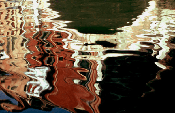
Ernst Haas (March 2, 1921 – September 12, 1986) was an Austrian-American photojournalist and Colour Photographer . During his 40-year career Haas trod the line between photojournalism and art photography. In addition to his coverage of events around the globe after WW1 Haas was an early innovator in colour photography. His images were carried by magazines like Life and Vogue and, in 1962, were the subject of the first single-artist exhibition of colour photography at New York’s Museum of modern art. He served as president of the cooperative Magnum Photos. His book of Volcano photographs, The Creation (1971), remains one of the most successful photography books ever published, selling more than 350,000 copies.


For Haas I’m focusing on his work on reflection and movement of water. Haas pioneered colour photography and is also famous for his images of movement using long shutter speeds. He photographed water through his career, fascinated by its ability to reflect the light and its dynamic movement. He crops the subject to increase the sense of abstraction.
HIS PHOTOS

MY UN-EDITED SHOOT BASED ON HIS PHOTOGRAPHY –


Personally my favourites are:
Alfred stieglitz
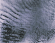
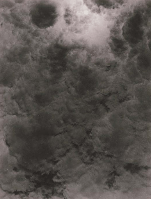
Alfred Stieglitz (January 1, 1864 – July 13, 1946) was an American photographer and modern art promoter who was instrumental over his 50-year career in making photography an accepted art form. In addition to his photography, Stieglitz was known for the New York art galleries that he ran in the early part of the 20th century, where he introduced many Avant-garde European artists to the U.S. He was married to painter Georgia O’Keeffe.


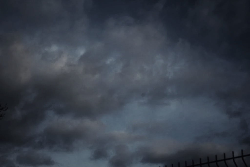
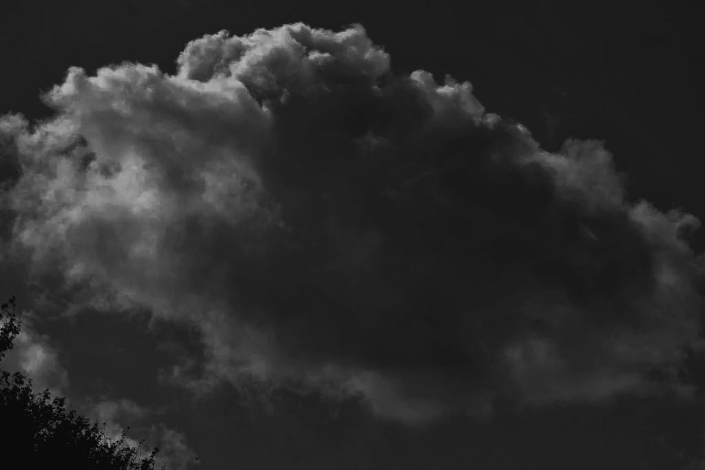
In the summer of 1922, Alfred Stieglitz began to take photographs of clouds, tilting his hand camera towards the sky to produce dizzying and abstract images of their ethereal forms. In an article the following year, Stieglitz maintained that these works were a culmination of everything he had learned about photography in the previous forty years: “Through clouds [i wanted] to put down my philosophy of life – to show that my photographs were not due to subject matter – not to special trees, or faces, or interiors, to special privileges, clouds were there for everyone – no tax yet on them – free.” Over the next eight years, he made some 350 cloud studies, largely produced as contact prints on gelatin silver postcard stock.
HIS PHOTOS


MY UN-EDITED SHOOT BASED ON HIS PHOTOGRAPHY –


My favourites:
EDITED

Aaron Siskind
Aaron Siskind (December 4, 1903 – February 8, 1991) was an American photographer whose work focuses on the details of things, presented as flat surfaces to create a new image independent of the original subject. He was closely involved with, if not a part of, the abstract expressionist movement, and was close friends with painters Franz Kline (whose own breakthrough show at the Charles Egan Gallery occurred in the same period as Siskind’s one-man shows at the same gallery).


Siskind was interested in surfaces and textures, both from the natural world but also the urban environment. He gets in close to his subjects and fills the frame with detail. There is always a strong sense of design and all over interest for the viewer.


Saul Leiter
the American artist Saul Leiter became enchanted by painting and photography as a teenager in Pittsburgh. After he relocated to New York in 1946, his visionary imagination and tireless devotion to artistic practice pushed him to become one of the most iconic photographers of the mid-twentieth century. An innate sense of security made him a lifelong student of art of all kinds, and he retained his spirit of exploration and spontaneity throughout his long career, in both his fashion images and his personal work


LEITER began experimenting with colour photography in New York in the late 1940s, using slide film such as Kodachrome. The 2006 release of his first monograph, EARLY COLOUR, revealed radically innovative compositions and a groundbreaking mastery of colour that permanently changed the history of photography. Though Leiter sometimes defended the use of colour in fine art photography, he refused to analyse or explain his own work. “I don’t have a philosophy,” Leiter said. “I have a camera.”
SAUL LEITERS PICTURES


COMPOSITION AND ANALYSIS
Leiter’s work showed great but odd composition. He didn’t put the subject in the middle like people would usually do, instead he put it in the upper right quadrant of the photograph.
“Photography is about finding things. And painting is different – it’s about making something”
HOW TO TAKE PHOTOS LIKE SAUL LEITER
To capture photos reminiscent of Saul Leiter’s picture-taking style—adopt the key points below:
1. Embrace Colours
Use Muted and Pastel Tones: Unlike the vibrant and saturated hues often seen in modern digital photography, Leiter favoured a subdued colour palette when taking photos. So, look for subjects exhibiting muted and pastel colours, such as old buildings, faded signage, and weathered surfaces and use them to create a calm and evocative mood in your photos.

Experiment with Film or Film-Like Filters: Consider using film or digital filters that mimic the look of film to achieve the soft, nostalgic quality characteristic of Leiter’s work. For example, choose vintage film stocks like Agfacolor or Kodachrome because people (including Saul Leiter) widely used them from the 1950s onward.
Adjust White Balance: Experiment with your camera’s white balance settings to achieve a warmer tone or a colder tone that enhances the muted/pastel effect.

2. Seek Out Reflections and Layers
Photograph Through Windows: Reflections in windows and glass surfaces were a hallmark of Leiter’s photography. Therefore, look for opportunities to capture scenes through windows, glass doors, and shop displays, using the reflections to add depth and complexity to your images. Moreover, these surfaces can create layered compositions by reflecting scenes from different angles.

Use Mirrors and Other Reflective Surfaces: Mirrors, puddles, and other reflective surfaces can add intriguing layers and create abstract compositions. Thus, experiment with different angles to see how reflections can transform your photos.
Play with Composition: Create a sense of depth and complexity by positioning yourself so that multiple layers of reflections and objects overlap in the frame. Additionally, use reflections in the foreground to frame the main subject in the background. This compositional technique adds depth and guides the viewer’s eye through the image.

3. Focus on Abstract Composition
Tight Cropping and Unusual Angles: Leiter often used tight crops and unconventional angles to create abstract compositions. So, don’t be afraid to cut off parts of your subject or frame your shot in ways that add a sense of mystery and abstraction.
Play with Light and Shadow: Attend to how light and shadow interact in your scene. For instance, use these elements to create striking contrasts and abstract shapes within your compositions.

Shoot Through Objects: Shoot through fences, glass, or foliage to add layers and abstraction to your images. These obstructions can act as filters, altering the scene and adding complexity. Moreover, use foreground elements to partially obscure your subject to create a sense of depth and abstraction.
Embrace Minimalism: Incorporate negative space to create a minimalist and abstract composition. This technique can draw attention to the subject, creating a sense of balance and simplicity. Furthermore, isolate your subjects against plain backgrounds to emphasise their form and colour, turning them into abstract elements.

4. Capture the Everyday
Find Beauty in the Mundane: Leiter had a talent for finding beauty in ordinary moments and scenes. To do so, focus on ordinary subjects like people walking, street vendors, or parked cars. These everyday elements can become fascinating when captured thoughtfully. Alternatively, notice the textures and patterns in mundane objects and scenes, such as peeling paint, cobblestone streets, or the arrangement of items in a shop window.

BLANK SPACE PROJECT
HOW DOES SAUL LEITER USE BLANK SPACES TO CREATE DEPTH AND OBSTRUCTION?


AFTER SAUL LIETER
NO FOCUS / OUT OF FOCUS PHOTOGRAPHER

UNUSUAL FRAMING CHOICE AND OBSCURED AND DISRUPTED VIEWS PHOTOGRAPHER

EXPRESSIVE COLOUR PHOTOGRAPHER
PRACTICAL PHOTOGRAPHY WORK


EDITS
EVALUATION
I began this project by researching a variety of artists and photographers online whose work expressed the theme of Abstraction. I particularly responded to the work of Ernst Haas. His images are imaginative and skilful, and I was keen to explore how to create photographs how he does.
I have explored a range of media, processes and techniques in this project including the play of light, natural forms and water and reflections. I found the technique of natural forms very challenging, and it took me a long time and plenty of patience to make real progress.
I am pleased with my final outcomes because they represent how I feel about the theme of Natural forms. If I had more time, I would like to explore the theme of Natural forms in even more detail by exploring different places and experimenting with different textures and shapes.